Design portfolio or text CV: which one should you send?
Recruiters open your portfolio in two very different situations. One wants charts and a story. The other is a parser that wants plain text. Here is how to prepare both, in what order to put your sections, and which template fits your profile.
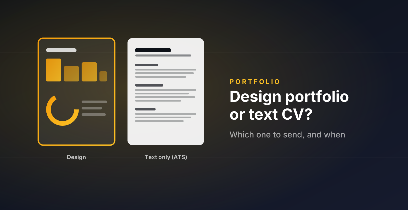
A data portfolio is read by two very different readers. One is a person with four minutes between two meetings. The other is a piece of software that turns your file into text and looks for keywords. Most people prepare for one and forget the other. This guide is about preparing both, without doing the work twice.
The two readers
The human. A recruiter, a hiring manager, sometimes a future colleague. They open your link from LinkedIn or from a message you sent. They look for about four minutes. They want to know, fast, what you can do, what you have actually built, and whether you would fit the role. Charts help here. A clear visual of your skills or your projects is read faster than a paragraph.
The parser. When you apply through a form, your CV goes into an applicant tracking system first. It extracts the text and matches it against the job description. It does not see charts. It often breaks on two-column layouts, icons, and text inside images. If the parser reads nothing useful, the human never gets your file.
So the rule is simple. The design version is for the human who already chose to look. The text version is for the form.
When to send which
| Situation | What to send |
|---|---|
| Application form asks for a CV | Text-only PDF |
| Your LinkedIn profile, the Featured section | Portfolio link |
| First message to a recruiter | Portfolio link, one line about one project |
| A recruiter replies and asks for your CV | Text-only PDF, and the link again |
| Interview invitation | Design PDF or the live page, whichever you prefer to walk through |
| Email signature | Portfolio link |
One thing people get wrong: they send the design PDF to the form because it looks better. It does look better. The parser does not care, and the human may never see it.
Order your sections to answer the first doubt
Every recruiter opens your page with one doubt in mind. Your section order should answer it in the first screen.
Projects first
Your doubt is "can this person do the work?". Show the work. Then Skills, then Experience last, framed around what transfers (stakeholders, domain knowledge, rigour).
Experience first
Your doubt is seniority and context. Lead with roles and what you owned. Projects come second, as proof of range beyond the day job.
Skills, then Projects
You do not have much experience, so do not lead with it. Show what you know, then show it applied. Put Education inside Experience, near the end.
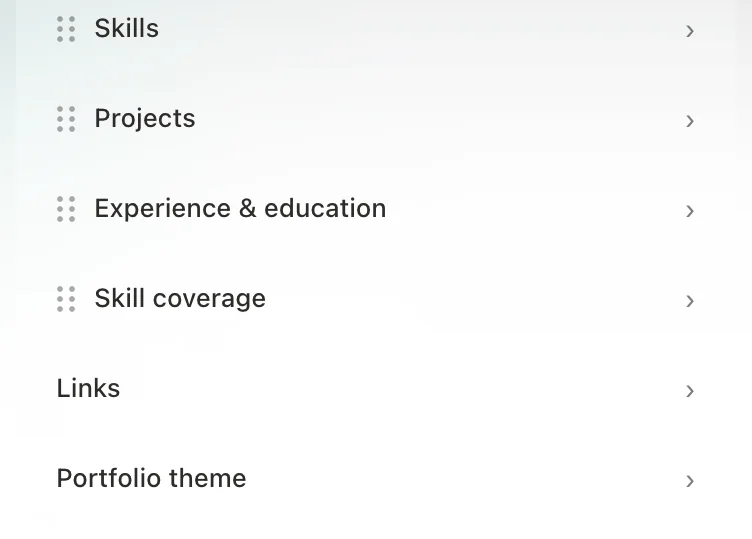
In the D8A builder you drag sections by their handle. Your public page follows the same order. Change it when your situation changes. The order you had as a student is not the order you need two years later.
Pick a template that fits your data, not your taste
Each section has three templates. Here is how to choose, section by section.
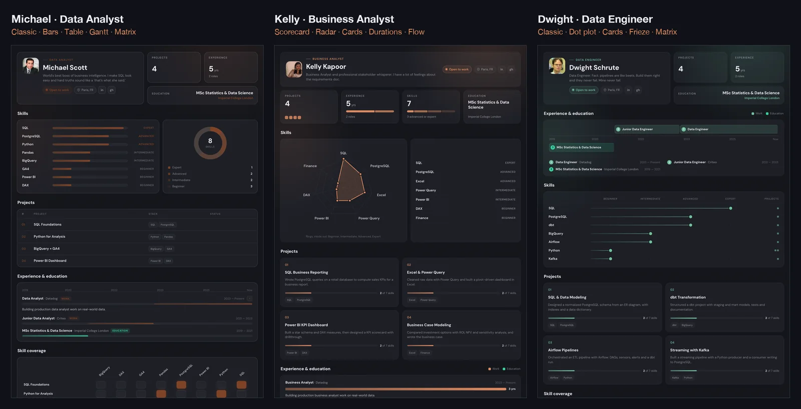
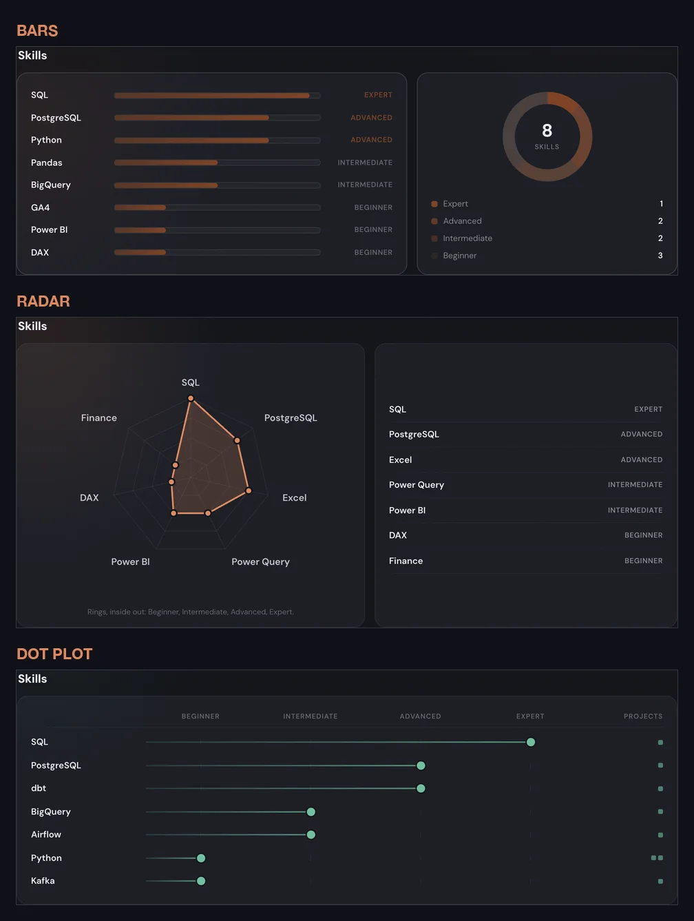
Skills. Bars are the safe default and read well with a long skill list. Radar works when you have five to eight strong skills and want to show a shape (for instance SQL, Python, dashboards, statistics, communication). The dot plot is best when your projects back your skills: it shows the level of each skill and how many projects use it, so the proof is next to the claim.
Projects. The table is for people with many projects and a reader who scans. Cards are for a handful of strong projects, each with a visual of how much of your skill set it covers. Featured is for when one project is clearly your best: it gets the big card and the rest are ranked below. If you are applying for a specific role, feature the project closest to that role.
Experience. The timeline is the honest default, and it shows gaps plainly, which is fine. Durations, a bar chart of how long each role lasted, suits people with a few long roles. The frieze, roles above a year axis and degrees below, is the compact choice when you have both a career and recent studies.
Skill coverage. This is the section recruiters mention most, because it answers "where is the evidence?". The matrix is the plain project-by-skill grid. The ranking sorts skills by how many projects prove them. The flow diagram draws a ribbon from each project to each skill it uses, which is the most striking one, and the slowest to read. Use it when you have four or more projects.
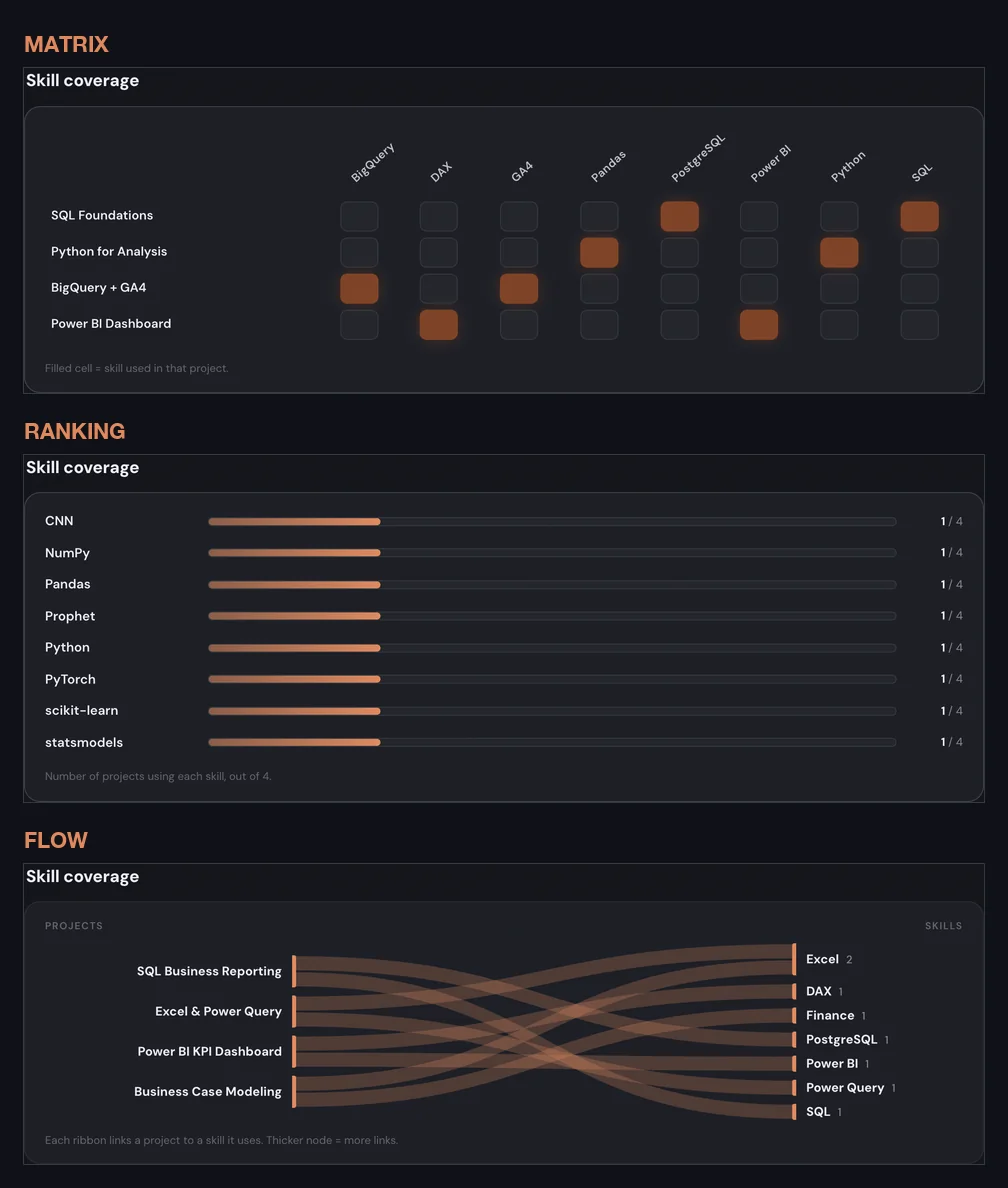
A page where every section is a radar or a sankey looks like a dashboard demo, not a person. One striking chart per page is enough. Keep the rest simple.
What the text version actually contains
The text-only PDF from the builder is one column, white, standard margins, no graphics. It has your name, your headline, one contact line with location, LinkedIn, GitHub and portfolio URL, then your summary, skills (strongest first, as a plain comma list), experience, projects with their skills and GitHub link, and education. The text stays selectable, so the parser reads it as you wrote it.
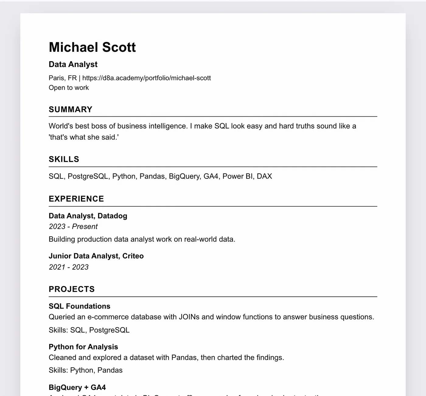
Three things to check before you upload it:
- Your headline names the role you want. "Data Analyst" beats "Data enthusiast". Parsers match titles.
- Your skills list uses the words in the job description. If the post says "Power BI" and your portfolio says "dashboards", add Power BI to your skills if it is true.
- Your project blurbs contain the method, not only the result. "Built a churn model with logistic regression in Python, 0.81 AUC" gives the parser and the human something to match.
Where to put the link so people actually click it
- LinkedIn Featured section. Add the portfolio link as a featured item. It gets a preview card and sits above your experience.
- LinkedIn headline or About. One short line: "Portfolio: d8a.academy/portfolio/your-name".
- Every outreach message. Not as a "please check my portfolio", but as "here is the project I mentioned", with the link. More on that in the recruiter network guide.
- Email signature. Costs nothing, and recruiters reply by email.
Keep it current
A portfolio that says "looking for a role" when you have had one for a year is worse than no portfolio. Every time something changes, update the page: new project, new role, new target. Both PDF versions are generated from the page, so updating once updates everything. Ten minutes a month is enough.