Which chart should you use? The decision grid
Nine questions, nine answers. Pick charts by what you are asking the data, not by what looks impressive. Free print-ready PDF.
Get the free PDF
One page, print-ready, free to share. No signup needed.
Chart choice is not aesthetic, it is grammatical: each chart type answers one kind of question. Ask the question first, and the chart picks itself.
The decision grid
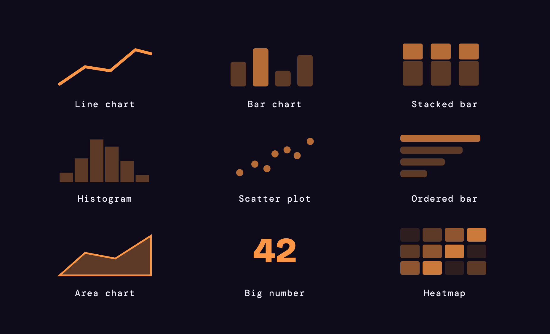
| The question | The chart | The note |
|---|---|---|
| How did it change over time? | Line chart | time on x, always |
| How do categories compare? | Bar chart | horizontal when labels are long |
| What are the parts of a whole? | Stacked bar | pie only with 4 slices or fewer |
| How is one variable spread out? | Histogram | bin width changes the story |
| Are these two things related? | Scatter plot | add a trend line, never a dual axis |
| What is the ranking? | Ordered bar | sort by value, not alphabet |
| Trend and volume together? | Area chart | one series, or it turns to mud |
| One number that matters? | Big number | plus the change vs last period |
| Two categories crossed? | Heatmap | let the color scale do the work |
The trap: the 12-slice pie
Past 4 slices nobody compares the angles. Past 6 it is decoration. The same data as an ordered bar reads instantly. And the dual axis is worse: two scales, one lie; split the charts instead.
If you must show share of total: top 3 slices + "other", or an ordered bar.
Bar or line?
The most common hesitation, settled:
Bar when: comparing categories, discrete periods (Q1 vs Q2), rankings and top-N, long labels (go horizontal).
Line when: continuous time, many points and one trend, up to 4 series, rates and indexes.
Safe defaults
- In doubt? Bar chart. It is almost never wrong.
- Colors: one accent, grey the rest. Highlight the answer.
- Axis at zero: bars always. Lines may zoom, but say so.
- 3D charts: no. Not once. Not for the CEO either.
Frequently asked questions
When is a pie chart OK?
Should I use a line chart or a bar chart?
How do I show two measures on one chart?
What is the best chart for survey results?
Get the free PDF
One page, print-ready, free to share. No signup needed.